informational text
A good Informational text is one that demonstrates the author is an expert in a particular field. The author creates an organized and well thought-out piece that helps enlighten the reader understand better the content. For instance if the student is writing an autobiography and they are a gamer who spend countless hours playing Minecraft, it might be a good idea to reveal what is so appealing about playing the game and what it says about who you are. If my grandmother was very influential in my life and helped me enormously become the man I am, then it would make sense for me to include a chapter about the woman. If I am an expert at Knott's Berry Farm, I might create chapters on only rollercoasters, or chapters on the various seasonal events at Knott's. I might create chapters based on live performances, or chapters on available food options. I might create chapters on the museums available throughout Knotts or just focus on Knott's Scary Farm.
Sometimes the student will be asked to read a couple of articles on a topic, like "avocados" for instance that will be overarching. These articles may discuss how to grow your own avocado tree, the care and lifespan of a tree, making guacamole, why the avocado is a fruit, and so on... and then the student will be asked to write an informational text on the cause and effect of growing your avocado pit in a glass bottle.
The most important thing about writing informational text is that you are passionate about what you are choosing to write about, and that your voice comes through on the page. You follow a logical sequence that introduces the topic, it's followed by several chapters on the topic, and that it concludes with your reasoning on why you chose to write about your particular topic.
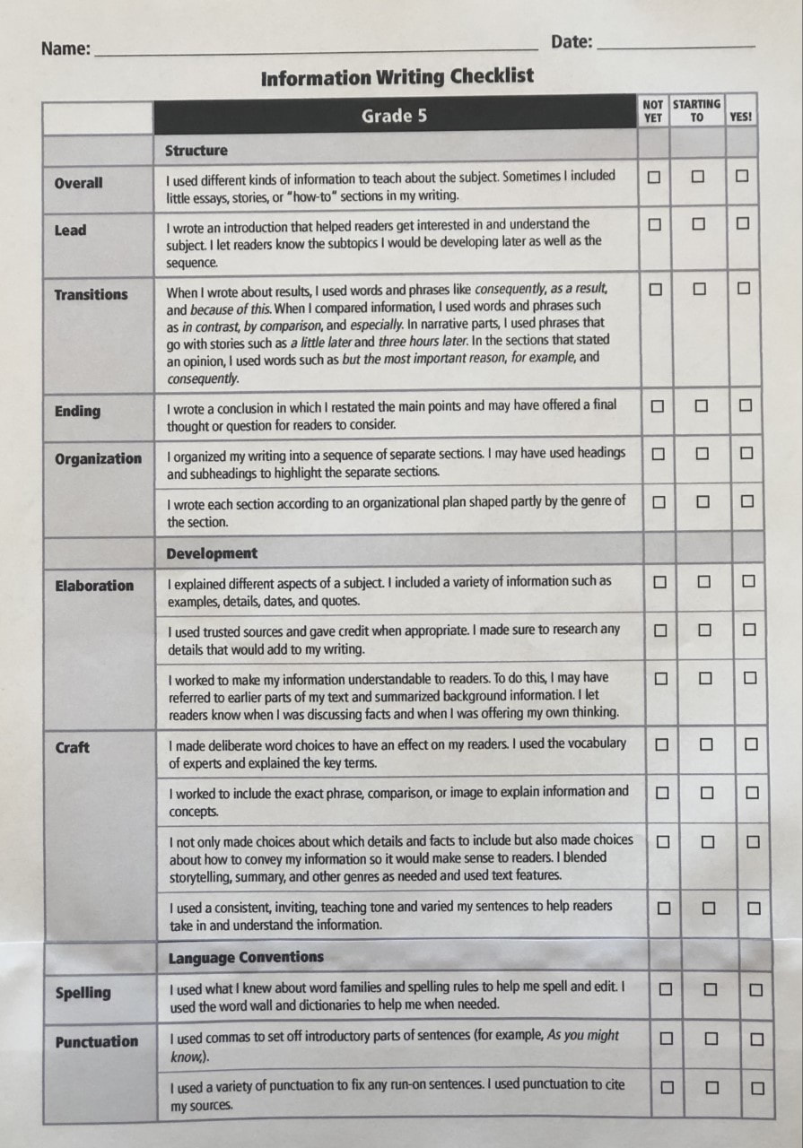
Informational Writing Checklist
The Informational Writing Checklist (5th Grade) below can help the writer
make sure that he/she are writing an informational essay.
make sure that he/she are writing an informational essay.
Thesis Statement or Main Idea
The thesis of an essay is its main idea, claim, or central proposition. We need to have a thesis statement or main idea in every academic essay we write. A thesis statement clearly identifies the topic being discussed, includes the points discussed in the paper, and is written for a specific audience. Your thesis statement belongs at the end of your first paragraph, also known as your introduction.
Examples:
I am going to write about how the Food and Drug Administration allows a certain amount of fly larva, rat hairs, and bug parts in some of our favorite foods.
I am going to write about the inventions and innovations Cousteau created to help others learn about the sea.
I am going to write about how Annemarie displays bravery in Number the Stars.
I am going to write about how Charley Quinn learned to be a man from an unlikely character.
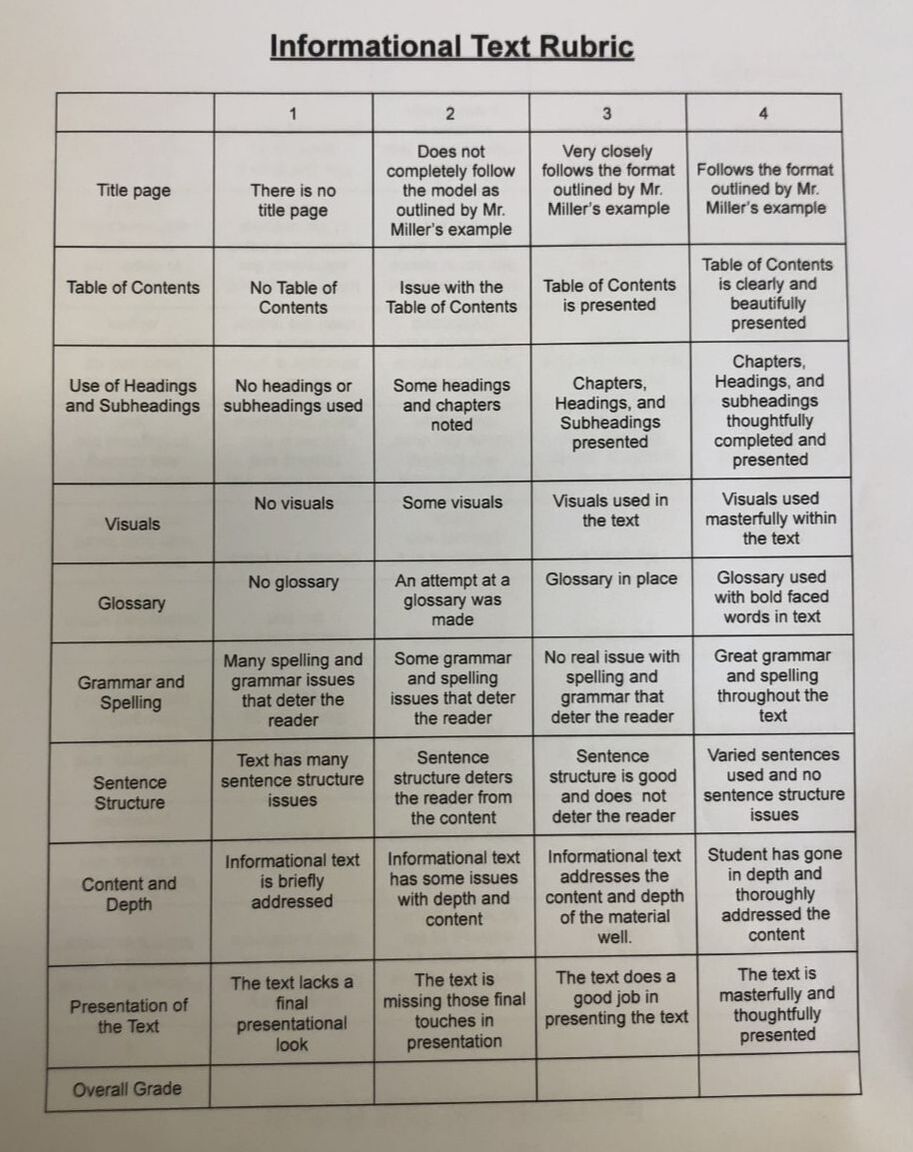
Rubric for Writing Informational Text
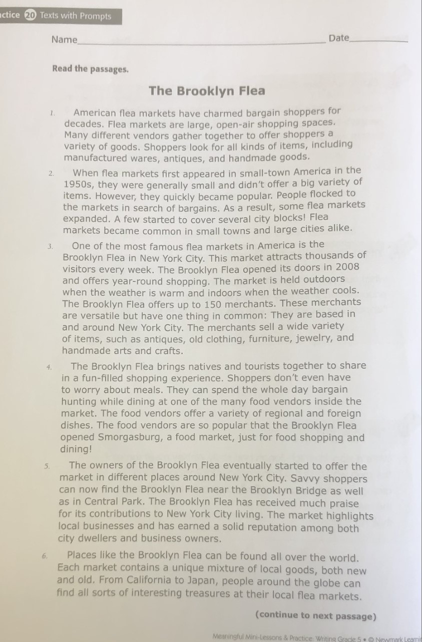
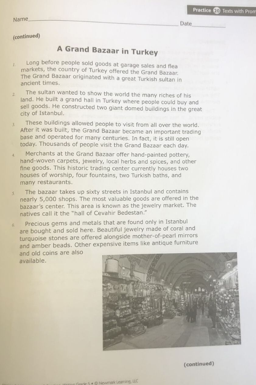
Compare and Contrast Essay
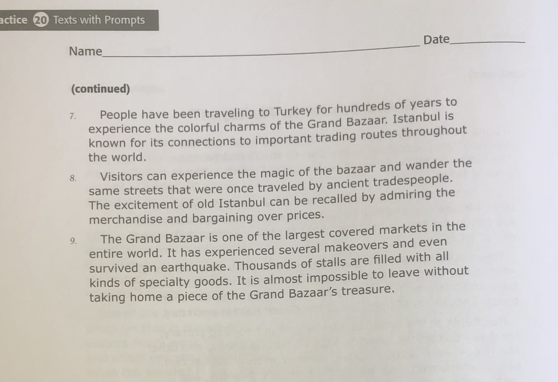
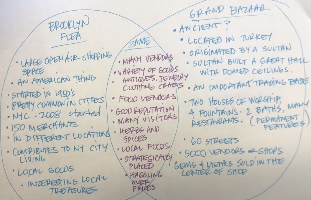
The Brooklyn Flea and The Grand Bazaar in Turkey
The Brooklyn Flea and The Grand Bazaar in Turkey
THE COMPARE CONTRAST ESSAY IN 1 PARAGRAPH
Both the Brooklyn Flea Market and the Grand Bazaar in Turkey have similarities but I think they are much more different than they are similar. Both markets have many vendors where a variety of goods is sold. People, both natives and visitors, look forward to going because of the options of goods offered and the variety of food. The flea markets open up on the weekends in familiar open spaces, but the Grand Bazaar is open everyday in the same well known location. The iconic Grand Bazaar is a much more permanent, essential and cultural business as it was originally built by a sultan hundred's of years ago. It houses elaborate domed ceilings, two houses of worship, Turkish baths, fountains, and hundreds of restaurants. The Grand Bazaar has over 5000 vendors compared to the much smaller flea market of around 150. Haggling is a necessary piece of the shopping experience but one of the most significant differences is the high end jewelry exchange located in the center of the bazaar. Vendors at a local flea market probably aren't carrying thousands of dollars in valuable gems and materials.
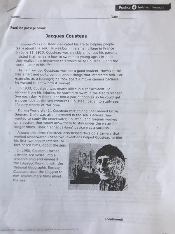
"Jacques Cousteau" Articles
The Writing Prompt: In the first paragraph, the author says that Cousteau "dedicated his life to helping people learn about the sea." Use other facts from the text to explain why this is true."
|
HOW DID COUSTEAU
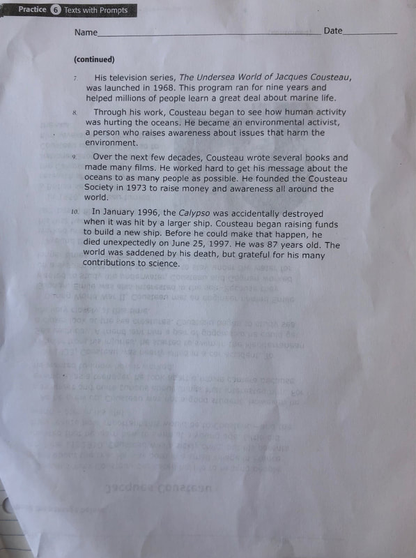
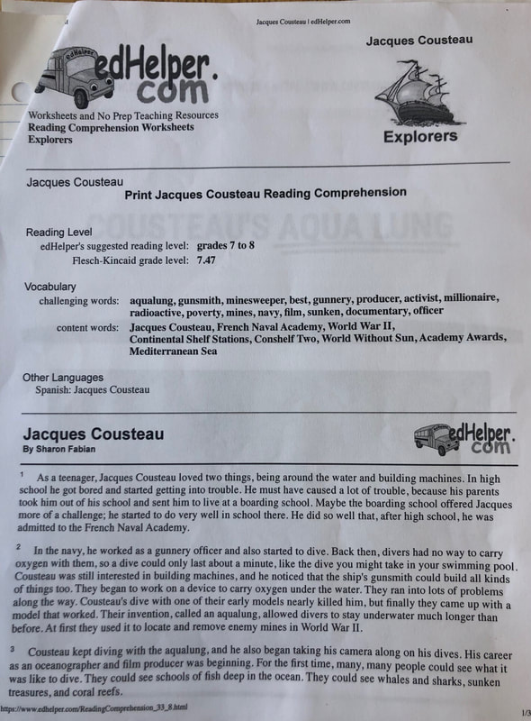
HELP OTHERS LEARN ABOUT THE SEA? Brainstorming for Evidence: From "Jacques Cousteau,"Texts with Prompts: Par.4: aqualung Par.5: underwater camera and documentaries Par.6: the Calypso research ship Par.7: "The Undersea World of Jacques Cousteau" Par.8: environmental activist Par.9: books, film, and the Cousteau Society From Sharon Fabian's article on EdHelper.com People could see what it was like to dive, see schools of fish, whales, sharks, sunken treasure and coral reefs. "Aqua Lung" from Cousteau.org "This new equipment reduced fatigue and consequently air consumption allowing the divers to move about more quickly and for a longer time." |
HOW-TO ADDRESS
THE INFORMATIVE WRITING PROMPT IN A 3-PARAGRAPH FORMAT Include in the introduction paragraph #1: hook information on the topic the prompt an anecdote on the topic thesis statement What goes in the body paragraph #2? 1) be sure to include information gathered from all 3 articles if possible: A) "Jacques Cousteau" from the article, Texts with Prompts B) "Aqua Lung" C) Sharon Fabian's ideas from EdHelper Wrapping it up in the Conclusion Paragraph #3: 1) Readdress the thesis statement in a different way 2). Leave the reader with an epiphany (or an Aha) from your new learning. |
Chris Miller January 25, 2024
Writing: Informative 3-Paragraph Essay
Informative Writing Prompt
on Jacques Cousteau
Prompt: In the first paragraph, the author says that Cousteau “dedicated his life to helping people learn about the sea.” Use other facts from the text to explain why this is true.
“The Underwater World of Jacques Cousteau” was some of the best television a boy could ever watch. There was SCUBA, water craft, airplanes, choppers, spear guns, and wild sea creatures. Sometimes my GI Joes became frogmen and underwater explorers of the Cousteau Society searching for giant Manta Rays and Bull Sharks. Cousteau was an old skinny oceanographer in speedos from the 1970’s, and being a pioneer in this field he helped teach all of us about the sea and to give us an understanding and appreciation for the ocean that maybe wasn’t there. I am going to write about how Cousteau helped others learn more about the sea through his innovations like the aqualung.
Cousteau didn’t necessarily invent the aqualung, but he made drastic improvements with it, which according to Cousteau.org, “reduced fatigue and… air consumption.” This allowed others to SCUBA comfortably and for extended periods of time. Cousteau basically took the danger out of diving and with that allowed others the opportunity to try their own adventures underwater. The aqualung is huge innovation but so is the underwater camera. Yes that is his invention, according to the “Jacques Coustaeu” article from Texts with Prompts. This article also stated that besides the aqualung and underwater camera, Cousteau also had a TV show called “The Underwater World of Jacques Cousteau.” He worked with the National Geographic Society, where he produced many documentaries, he wrote books, he created a floating research lab and named it Calypso, and an environmental conservationist. He defined what it was to be a conservator of the sea. Eventually Cousteau founded the Cousteau Society which is a world-wide organization dedicated to teaching others about the sea and our role in conservation. I think in the Sharon Fabian article she sums it up best when she says that because of Cousteau many people were able to observe groups of fish together underwater along with big sea creatures never before observed. People could see what old shipwrecks looked like and they could see how beautiful and vibrant the coral reefs can be. Cousteau helped open our eyes.
Cousteau’s work helped us have an appreciation and love for the sea. We learned a lot about the sea and its inhabitants because Cousteau‘s passion for the sea was so great. He dedicated his adult life to helping others learn through innovations like the aqualung, underwater camera, and his numerous productions in film, but one often overlooked innovation is also in becoming an environmentalist. He pointed his finger at those out to destroy the ocean and its creatures as in the decimation of whale populations. Here Cousteau stands out as a monumental figure that changed the world for many generations to come.
Mr. Miller's Informational Text Example #1
I CONSIDERED MYSELF AN EXPERT IN RECREATING COLLEGE MASCOTS, AS I BELIEVE THIS STYLE OF ART WAS MY OWN TYPE OF CREATION. BEING AN EXPERT AT RECREATING THE MASCOTS, I THOUGHT OF THIS EXAMPLE AS A HOW TO FOR SOMEONE TRYING TO UNDERSTAND THE PROCESS
Christopher Miller December 10, 2023
Writing: Informational Text Expert Essay
"Art: College Logos"
Writing: Informational Text Expert Essay
"Art: College Logos"
Table of Contents
Chapter 1, “Why College Logos” page 3
Chapter 2, “Choose Wisely” page 4
Chapter 3, “The Process” page 6
Chapter 4, “Paint Makes Perfect” page 9
Chapter 5, “Final Results” page 12
Glossary of Terms page 13
Chapter 1
“Why College Logos”
The college logo has always been fascinating for me and I believe it began because i had attended California State University Dominguez Hills. Their logo is a bull, and the school mascot was the “Torro,” but the problem with the “Torro” for me was that the school hardly had any camaraderie. Perhaps it was because I was not playing any sports there so I didn’t know of any games going on. There was no football games either, and to be honest we never knew when they were having games. Most people attend CSU Dominguez Hills, because it is a good school to finish up something already started. Most people are working as well as attending so that camaraderie is lost.
I always wanted to go to a major university to play volleyball but I was too much of a knucklehead to have been successful enough academically to get in. If I had it all to do over again, I sure would have put much more effort into being an amazing student that had a chance to attend a Division 1 school where sports were an important aspect of college life on campus. I feel like I always missed out on that, so when I hear that young people I know are going off to college I am so excited for what they are about to experience. This is one of those things that got me excited about the college logos.
In the year of 2017, my students and I built a 6 meter geodesic dome and called it the Dr. Anna Lee Fisher Planetarium. It was named after an astronaut from San Pedro, CA. On the outside of the dome, we attached several NASA patches from various space programs that students painted. These were 3-dimensional as well.
The following school year the class focused on college logo and we were able to accomplish 9 of them. Then during the instructional year of COVID, I spent my lunch hours recreating 19 more of them. It was a lot of creative fun for me when no children were in class. This is how I started to create the college logos for my classroom, and I believe I am an expert at this process, and so much so, that I am going to tell you all about how they are created from ideas to finished product.
Chapter 2
“Choose Wisely”
One of the most important aspects that goes into choosing a college logo is to find one that interests me. That means I have to have some sort of connection with the school or the logo itself. When I first started creating the college logos with my students, I asked them about which one they were interested in doing. Some of the kids weren’t that interested or on top of their academics to spend the extra time on painting the subjects. And some students didn’t want to miss out on their recess time to paint. These were some of the first obstacles I faced.
How to Choose a Logo
I have always chosen a logo that is of interest to me or students. That is the reason why the logo for Austin Peay college was chosen because some of the boys that were interested in it liked the logo.
For children I also want to choose something that won’t require very detailed or fine painting. Most logos are one single colored piece, which makes it an easier job for students to paint. Some logos may require much more work than another. For example when I did North Carolina University or the University of Arizona. Those logos were easy to cut out of cardboard as opposed to Clemson where the paws were time consuming and the Morehouse College Tiger was extremely time consuming and difficult to cut out and glue together.
I wanted to also represent all types of colleges. I wanted to make sure that I represented Historically Black Colleges and Universities (HCBU) to inspire some of my students by illustrating the awesome camaraderie they have on and off the field. I wanted to represent ivy league colleges, military academies, and also local universities that students may attend. One of the most populated universities for Latinx students was the University of Arizona.
As a joke, because I need to do that, I also included one logo that does not represent a university at all. It’s a minor league baseball team out of El Paso called the Chihuahuas. I wanted to see if students could find the one logo that doesn’t belong.
Another important feature of choosing the logo is whether to decide to go with an older school logo or the most up to date. Some schools that have a long history have many logos to choose from and are unique and more original. But it also poses a problem that requires some research. For instance I really like the Oregon State Beaver from 40-50 years ago as opposed to the newer more recent adopted Beaver. I have pictures of both beavers below:
The last issue when looking at logos is to consider whether the logo may be offensive to a particular culture or race. Almost all universities have stopped using Native American imagery in their school logos. Just like some professional sports programs have also stopped using the offensive imagery, others have been more resistant to change. The Atlanta Braves, the Cleveland Indians, the Washington Redskins are just a few of the organizations who have been resistant to change. I am uncomfortable with making anyone feel lesser than, so I have refused to do some college logos based on this idea. A school that I did not do, but really like was the San Diego Aztecs or The University of Mississippi’s Ole’ Miss Rebels.
The last issue when looking at logos is to consider whether the logo may be offensive to a particular culture or race. Almost all universities have stopped using Native American imagery in their school logos. Just like some professional sports programs have also stopped using the offensive imagery, others have been more resistant to change. The Atlanta Braves, the Cleveland Indians, the Washington Redskins are just a few of the organizations who have been resistant to change. I am uncomfortable with making anyone feel lesser than, so I have refused to do some college logos based on this idea. A school that I did not do, but really like was the San Diego Aztecs or The University of Mississippi’s Ole’ Miss Rebels.
That being said, I do have a logo cut out of cardboard, primed, and ready to be painted which is the Notre Dame’s Fightin’ Irish logo. Just as I had finished it, I read an article about how the imagery used is derogatory to some Irish Americans. There are some differing opinions on the topic, but once a general consensus is reached the mascot may have to come down. I grew up with the Notre Dame logo all around me, because it was a Catholic University that was a dominant force in football. Every Saturday my family watched Notre Dame take the field and all the men around me wore the Fightin’ Irish character on sweatshirts in support of the university’s football team.
Chapter 3
“The Process”
Once I have found the ideal college logo to do, I make a copy of the image so that it is roughly a five-inch image. Once I have the image on paper, I begin to make decisions on how many layers I may go with on a particular college logo. Some images may only merit two or three layers while other images may need seven or eight, and yet still others may require a layer all around a selected logo, just to make sure it looks right at the end. If you’re not sure, don’t worry about it. Another bottom layer can always be added much later in the process. I then take out the printed image and put it under the document camera which projects the image on to a wall. I stretch out a piece of butcher paper on the wall and trace the projected image of the college logo.
This is an important step and one of the most crucial steps in the whole process of recreating an enlarged college logo. You have to make sure that the image is not distorted. Sometimes when you project the image it can become distorted because it is leaning to a narrow edge toward the top or bottom. It is super important to make sure the image is directly facing front. That also makes it easy to trace in pencil.
Tools Needed
Cardboard, butcher paper, masking tape, sharpened pencils and pens, scissors, razor blade knives, plenty of razor blade replacements (some logos require 3 or 4 and others may use up to a dozen blades depending on the intricacies of the logo), a cutting mat, an exacto knife has been helpful at times, ⅛” paracord for hanging the logo, hot glue gun, and several hot glue sticks, KILZ spray primer, and I used acrylic paints from MYARTSCAPE, and they have always given me premium results:
Tracing the Image
A big part of the process is getting the outer dimension correct on butcher paper first, and that depends on the size of cardboard you have. I was gifted large sheets of cardboard that were approximately 34 inches wide by about 72 inches tall. I maxed out the college logo designs to be no more than 32 inches at its tallest or widest. In other words the Stanford University logo is 32 inches tall and the Cal State Northridge Matador’s cape is 32 inches wide:
There are two key things to watch out for when tracing the selected image. First, Once you start tracing you will need to finish tracing the entire image in one sitting. It is darn near impossible to match up any previously started image on the butcher paper, so you will need to plan ahead to make sure you have the allotted time for tracing the entire image. Secondly, do not make the mistake of accidentally bumping the table the projector is on. One slight jolt… even a heavy stepper crossing the path of the nearby projector can take it off your previous markings. The last thing I noticed was that when tracing the image on the butcher paper, it was important to hold down the paper on the wall as your pencil was making its marks. Sometimes the paper can float off the wall and mess up your work, which ultimately throws off the correct dimensions of the image.
A System of Patterns
Once we have an idea of the layers we are going to do with the college logo, we tape the butcher paper to the cardboard and begin to cut with a razor blade along the lines starting with the outside and work in. There is a time and place for using a straight edge when doing the college logos, but if it can be avoided it should. I used a straight edge in doing
the Arizona Wildcats logo, and maybe for the sword or the letter “A” in the U.S. Military Academy’s logo, and lastly for any kind of lettering where tracing did not quite get me the uniformity necessary.
An important rule in cutting out the cardboard pieces is to turn the cardboard layer 90 degrees. In other words, the flutes, that wavy line of paper sandwiched between two smooth layers of paper on the top and bottom, used in cardboard should alternate between layers. I have always done this because I felt that it was similar to the plywood process and that by doing this the cardboard would stand-up to the water-based paints used. Ultimately the cardboard when hanging on the wall would not be inclined to bend. One layer would brace another through the many layers of the 3-dimensional final product.
As the cutting happens during a project, it is important to keep track of what you have cut and what still needs to be cut. For instance when I was cutting out the mouth of the University of Florida’s Gator logo, I had to keep track of all those teeth. I labeled the top row by numbers and the bottom row by letters to keep them organized. Truth be told, one wrong or misplaced tooth could throw the entire image off. We want to avoid that at all costs.
Glueing
Glueing your cardboard is best done with hot glue. I have used Elmer’s White glue and wood working glue in a pinch and for smaller pieces, but overall nothing is better than the hot glue from a glue gun. When you lay down a bead of hot glue, the ideal is to spread the hot glue a bit with the piece you plan on glueing down, but be warned you have seconds to settle down on its final spot. Here are some other thoughts on glueing:
Chapter 4
“Paint Makes Perfect”
Priming
Priming is an essential part of painting the college logo, and I always use KILZ white primer for the job. Yes it stinks, so be sure to be in a well-ventilated room. The primer coats the surface of the cardboard all in white. Be sure to get the flurrys in the cardboard that you can see, and spray the logo from all the cardinal directions. This ensures that all areas are fully covered and ready for the acrylic paint.
Now some people will ask me, do I have to use a primer. Technically, the answer is no you do not. But what I have found after creating so many pieces is that it serves its purpose. For starters, the primer covers all the pen mark blemishes on the piece, so once it’s primed I can appreciate the beauty in the project. Secondly, by applying the primer, I have preserved the cardboard so that it won’t bend unexpectedly while waiting to be painted. And lastly, by priming the logo with a consistent generous layer of primer, I noticed that the top layer of cardboard will not buckle because it is saturated with wet paint. Covering ink with acrylic paint can be difficult, so priming makes that easier. It also adds a nice smooth coat overall. I highly recommend using primer first.
Chapter 3
“The Process”
Once I have found the ideal college logo to do, I make a copy of the image so that it is roughly a five-inch image. Once I have the image on paper, I begin to make decisions on how many layers I may go with on a particular college logo. Some images may only merit two or three layers while other images may need seven or eight, and yet still others may require a layer all around a selected logo, just to make sure it looks right at the end. If you’re not sure, don’t worry about it. Another bottom layer can always be added much later in the process. I then take out the printed image and put it under the document camera which projects the image on to a wall. I stretch out a piece of butcher paper on the wall and trace the projected image of the college logo.
This is an important step and one of the most crucial steps in the whole process of recreating an enlarged college logo. You have to make sure that the image is not distorted. Sometimes when you project the image it can become distorted because it is leaning to a narrow edge toward the top or bottom. It is super important to make sure the image is directly facing front. That also makes it easy to trace in pencil.
Tools Needed
Cardboard, butcher paper, masking tape, sharpened pencils and pens, scissors, razor blade knives, plenty of razor blade replacements (some logos require 3 or 4 and others may use up to a dozen blades depending on the intricacies of the logo), a cutting mat, an exacto knife has been helpful at times, ⅛” paracord for hanging the logo, hot glue gun, and several hot glue sticks, KILZ spray primer, and I used acrylic paints from MYARTSCAPE, and they have always given me premium results:
Tracing the Image
A big part of the process is getting the outer dimension correct on butcher paper first, and that depends on the size of cardboard you have. I was gifted large sheets of cardboard that were approximately 34 inches wide by about 72 inches tall. I maxed out the college logo designs to be no more than 32 inches at its tallest or widest. In other words the Stanford University logo is 32 inches tall and the Cal State Northridge Matador’s cape is 32 inches wide:
There are two key things to watch out for when tracing the selected image. First, Once you start tracing you will need to finish tracing the entire image in one sitting. It is darn near impossible to match up any previously started image on the butcher paper, so you will need to plan ahead to make sure you have the allotted time for tracing the entire image. Secondly, do not make the mistake of accidentally bumping the table the projector is on. One slight jolt… even a heavy stepper crossing the path of the nearby projector can take it off your previous markings. The last thing I noticed was that when tracing the image on the butcher paper, it was important to hold down the paper on the wall as your pencil was making its marks. Sometimes the paper can float off the wall and mess up your work, which ultimately throws off the correct dimensions of the image.
A System of Patterns
Once we have an idea of the layers we are going to do with the college logo, we tape the butcher paper to the cardboard and begin to cut with a razor blade along the lines starting with the outside and work in. There is a time and place for using a straight edge when doing the college logos, but if it can be avoided it should. I used a straight edge in doing
the Arizona Wildcats logo, and maybe for the sword or the letter “A” in the U.S. Military Academy’s logo, and lastly for any kind of lettering where tracing did not quite get me the uniformity necessary.
An important rule in cutting out the cardboard pieces is to turn the cardboard layer 90 degrees. In other words, the flutes, that wavy line of paper sandwiched between two smooth layers of paper on the top and bottom, used in cardboard should alternate between layers. I have always done this because I felt that it was similar to the plywood process and that by doing this the cardboard would stand-up to the water-based paints used. Ultimately the cardboard when hanging on the wall would not be inclined to bend. One layer would brace another through the many layers of the 3-dimensional final product.
As the cutting happens during a project, it is important to keep track of what you have cut and what still needs to be cut. For instance when I was cutting out the mouth of the University of Florida’s Gator logo, I had to keep track of all those teeth. I labeled the top row by numbers and the bottom row by letters to keep them organized. Truth be told, one wrong or misplaced tooth could throw the entire image off. We want to avoid that at all costs.
Glueing
Glueing your cardboard is best done with hot glue. I have used Elmer’s White glue and wood working glue in a pinch and for smaller pieces, but overall nothing is better than the hot glue from a glue gun. When you lay down a bead of hot glue, the ideal is to spread the hot glue a bit with the piece you plan on glueing down, but be warned you have seconds to settle down on its final spot. Here are some other thoughts on glueing:
- BE CAREFUL!!! I can not tell you how many times I have burned myself with hot glue. It can be helpful to have a rag nearby to swipe the hot glue off your hand or fingers in an emergency. Warning: Hot glue can cause 3rd degree burns!
- It is extremely helpful if you lay your piece down to be glued, get it just right, and then trace it on the cardboard. Once you have the hot glue on the smaller piece to be glued it is easy to align it and have your piece perfectly placed within the traced lines.
- Because you only have seconds before the hot glue sets, larger pieces need to be done separately. I have had giant pieces that needed to be glued down and it resulted in some of the glue setting while some of the glue was hot. The part of the piece where the glue had set can be easily lifted, reglued, and set back in place.
- Glueing the small detail pieces are essential in making the college logo look as authentic as possible. I find it easiest to lay down a small pea-size dab of glue and then place the small detail on top of that dab.
- Some hot glue may squeeze out the sides. If you can grab at it with another piece of cardboard before it sets, great. But if you can’t, don’t worry about it, because that squeezed out little glob will most likely be hidden within the painting process.
- Lastly, the hot glue shreds these very tiny little threads all over the piece you are working on. Try to clean your piece as you go from these tiny threads because they can become unruly and can mar the surface during the painting process.
Chapter 4
“Paint Makes Perfect”
Priming
Priming is an essential part of painting the college logo, and I always use KILZ white primer for the job. Yes it stinks, so be sure to be in a well-ventilated room. The primer coats the surface of the cardboard all in white. Be sure to get the flurrys in the cardboard that you can see, and spray the logo from all the cardinal directions. This ensures that all areas are fully covered and ready for the acrylic paint.
Now some people will ask me, do I have to use a primer. Technically, the answer is no you do not. But what I have found after creating so many pieces is that it serves its purpose. For starters, the primer covers all the pen mark blemishes on the piece, so once it’s primed I can appreciate the beauty in the project. Secondly, by applying the primer, I have preserved the cardboard so that it won’t bend unexpectedly while waiting to be painted. And lastly, by priming the logo with a consistent generous layer of primer, I noticed that the top layer of cardboard will not buckle because it is saturated with wet paint. Covering ink with acrylic paint can be difficult, so priming makes that easier. It also adds a nice smooth coat overall. I highly recommend using primer first.
Painting
Getting the Edges
The edges of the cardboard are crucial in establishing the 3-dimensional aspect of the logo, so it is important to stuff paint into the flutes. This means you need to be generous with your paint at all times while stuffing and scrubbing in the color to mask the white primer. While you are stuffing the flutes with paint, it will not be uncommon to miss some of the white. No matter how hard you try to get that little white visual speck of white and thrust paint at that area, it seems like there is nothing you can do. Don’t worry about it. For the most part everything will be covered enough that a viewer will not notice any small flash of white hidden up inside the flutes.
Another aspect about painting the edges is to determine where to start. What is the base color. A lot of the logos have a base of black as in a cartoon outline, so it will be most important to do the black first. It is super important to do the best job you can in saturating the edges and base with paint at this point because going back to fill in with color later will result in more touch up, which we want to try and avoid.
Doing the edges also means that the black will get up on the top surfaces which will ultimately be another color. I want to try and get students to wipe away anything off that top surface. A dark stain of paint is much easier to cover than a glob of black that has not been wiped off. Not to mention the cleanliness of the final presentation looks better if there are no globs that mar the surface of the project.
Redo the Primer
Redoing the primer means that we will go over the stains and globs left behind when we did the base and edges with the dark outliner of color. I had them to cover and so will students. This means you will need to repaint those top surfaces with white paint. Remember I spray paint the primer on, so spraying at this point will not work, which is why I suggest applying a generous amount of paint over the area that needs to be ready for new color. Doing this also hides any mistakes or errors up to this point. A word of caution… Be liberal with your paint, but try to avoid getting any of the white on the previously done dark outline. It will happen anyways but the less mistakes made here mean that less time and precision later on touch up.
Final Painting
You are getting closer and closer to the final finished logo, and having put in the dark outliner and you have also redone the primer, you can see all your hard work coming together. The top surfaces might require one color or more, but you want to work your way up, so starting at the very next layer up from the outline you want to start laying down the bulk of the color. As you can see in the Cal State Fullerton Titans logo here, Tuffy the Titan, an elephant, will be mostly gray (pictured in white). I suggest you choose a starting area of about 6 - 10 inches square and work your way in one direction. This means after you have applied a coat of paint to that square area make sure your brush strokes are all headed in one direction. If you are painting with partners make sure they determine the final direction all their individual brushstrokes will be going. This is not the most important rule to follow, but it will give the logo its best visual results.
Touch-Up
Touch-up is one of the most important aspects of finalizing your painting. It means that you are a stickler for details and it shows. You will need all of your paint previously used. If you had run out of a color, you will need to make a fresh batch for this process. I’ll address how to attack the logo if this scenario applies to you momentarily.
With all your colors out you will start off with what you did first and work your way through the logo; The base color, the outline, the next top surface and so on… This is a pain in the neck and means you will need to use a smaller brush and you will also need to clean it often as touch up of one color may take a few minutes and some colors even less. Even the slightest bit of touch up improves the overall quality of the final product. I can not say this enough, so keep working on it till you can’t take it anymore. Haha!
If you ran out of color and you need to make a fresh batch, it is imperative to get as close to the original colors you made. If you had to open a new bottle of orange yellow for example to finish the project hopefully it is extremely close to the color. Not all orange yellows will be exactly the same, but maybe so close we couldn’t visually see the difference anyways. In either case this is my plan of attack if this should happen to you…
First thing I will do is not run out of paint in the first place. Haha! O.K. really. I will paint just the spot that needs a touch up. If it is really small nobody will see a slight difference in color. If it is visible, I would recommend doing the whole area with the new color you will have to use. The good news is that you only have to get close to those pesky edges. If a little glob hits the side all the better, but the edges will have been complete from the beginning, right? Any mismatch will be slight and the viewer will not be able to detect one orange yellow from one bottle to the next bottle.
Once touch-up is done. It is ready to be hung up on your wall or office.
Chapter 5
“Final Results”
The final results of all the hard work is finally visible for all your admirers to see. I have included pictures of my classroom that has the college logo that are finished and some awaiting to be completed.
Glossary of Terms
cardinal directions: these are the four main points on a compass that point north, south, west, and east
Exacto knife: a razor-blade like knife on the end of a pen-size body and used for small intricate detailed cuts
flutes: also called corrugation. Looks like the wavy lines inside cardboard. It is used to strengthen cardboard
glob: a lump of semi-liquified substances
Historically Black Colleges and Universities: These institutions of higher education in the United States were established before the Civil Rights Act of 1964 with the intention of serving primarily the African American community. The U.S. Department of Education recognizes 107 such institutions
KILZ: A name brand of primer paints for all kinds of surfaces. I used the original spray.
planetarium: a structure in which images of stars, planets, constellations, etc. are projected on the inner surface of a dome for public entertainment or education.
The Autobiography
You have been tasked to write an autobiography, which means you will be writing about yourself. There are many ways you can accomplish this goal...
1) You can follow the traditional method of: "I was born on May 17, 2012... and determine your chapters maybe based on
typical milestones like playing volleyball for the first time, my brothers and sisters, etc.
2) You can do chapters on the people in your life, the athletics you play, the games you play, the best times, the worst
times, the things you love, your pets, etc. In this type of autobiography you are sharing with the reader those things
which help define who you are.
Whichever option you choose, we want you to be passionate and express that passion for what you are writing about. Make sure that you include an introduction page that will explain what your autobiography is about or its focus (Are you doing option 1 or 2) . Write your chapters (3-5 chapter topics). Conclude your autobiography. Be sure to proofread your essay for capitalization, end punctuation, and spelling. The rubric above is a good example of how this assignment will be graded.
